Let's transform thumbnails into vinyl covers
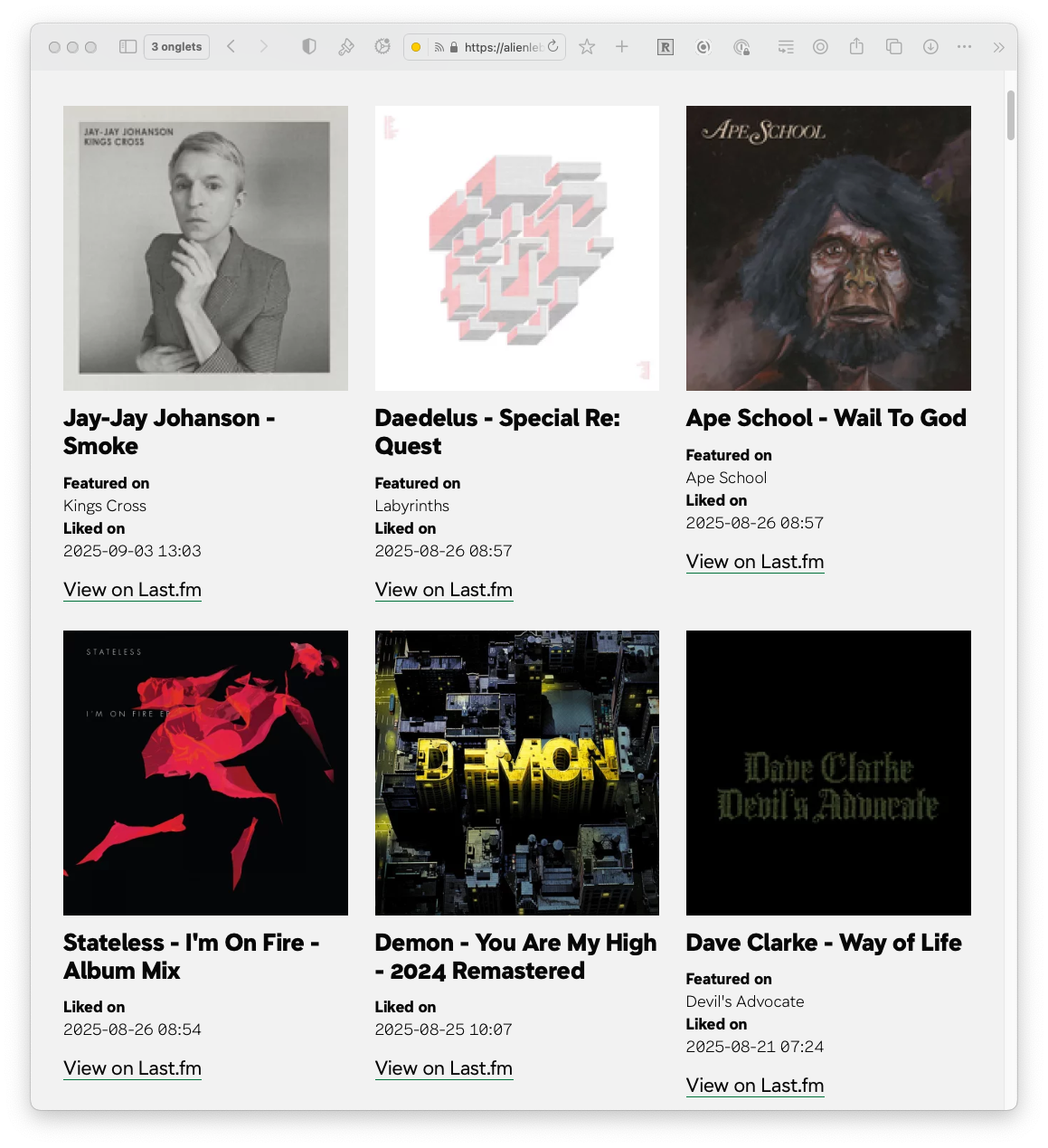
On the “Jams” page, I’ve listed the music tracks I’m currently playing on repeat. I love sharing the music I listen to; perhaps it’s my past as a DJ.
My inspiration for this page came from @paulrobertlloyd’s page, where he did something similar on his site.
For me, music is life. I’m a big fan, and I wanted the page to reflect that. However, it felt a bit too rigid and lacked the spontaneity that music represents for me.
That’s why, with a bit of CSS, I transformed the album thumbnails into vinyl sleeves, giving them an older, worn look. Some are still in their shrink wrap. I added a slight random orientation and a bit of shadow to create a less aligned and more lively presentation.
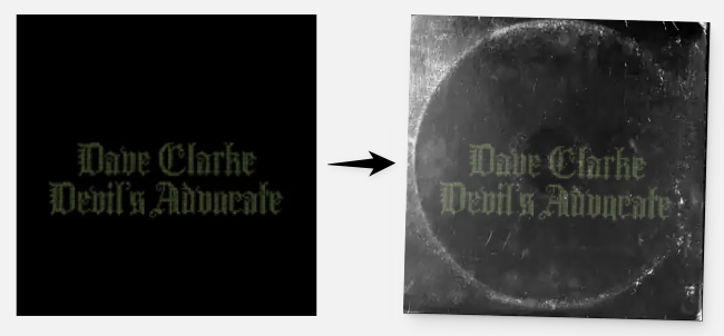
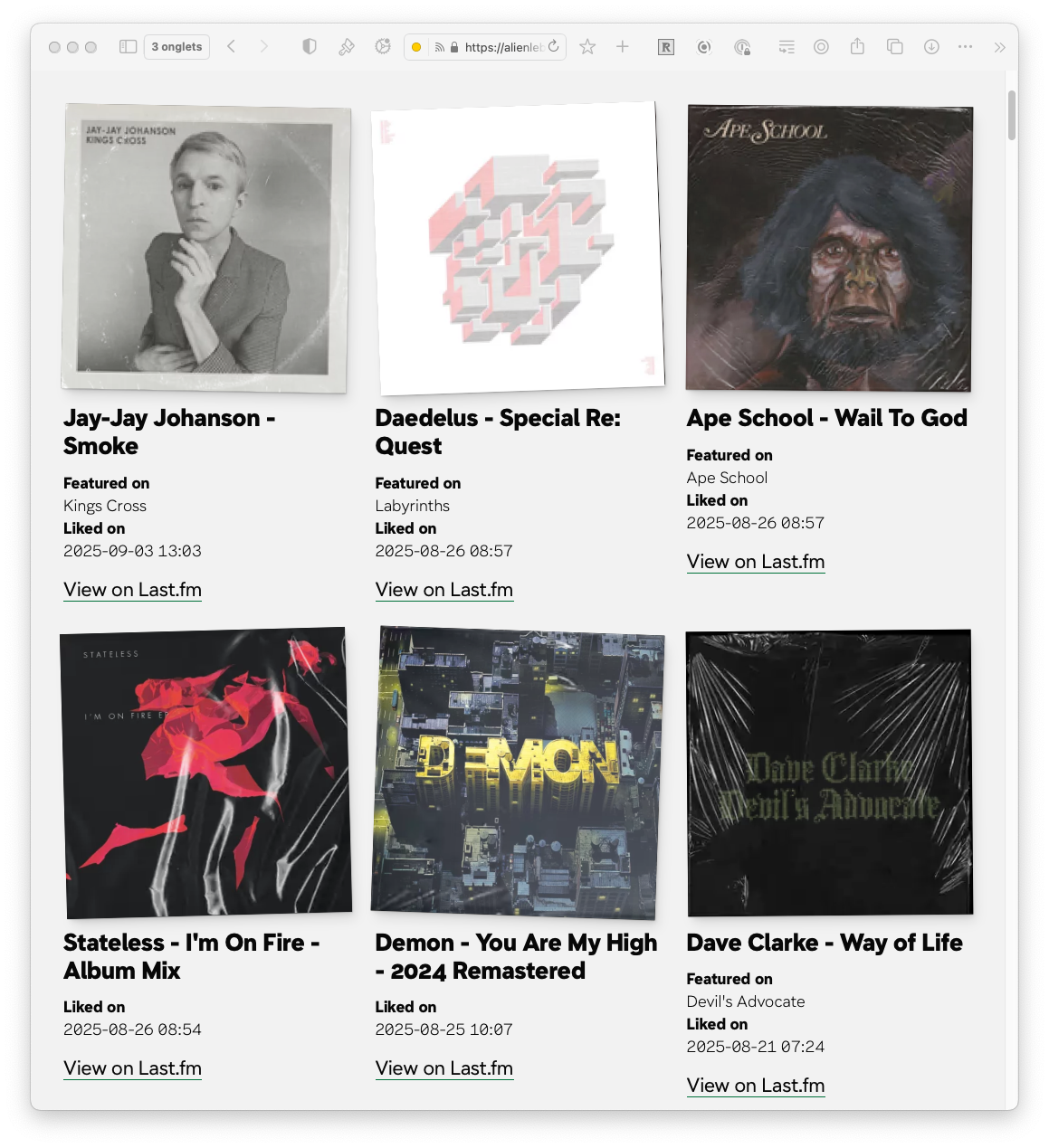
Everything is created using only CSS and some background images with mix-blend-mode: screen;.
The page isn’t the quickest to display, and there are still performance improvements to be made.
If you’re interested, here’s the CSS code.
/* ======================================================================
   # _components.sleeve.css
   ====================================================================== */

.c-sleeve {
   --sleeve-rotation: 0deg;

   box-shadow: var(--shadow-elevation-medium);
   transform: rotate(var(--sleeve-rotation));
}


/**
 * Sleeve plastic and used overlay
 */

ul li:nth-child(7n+1) .c-sleeve {
    --vinyle-img: url("/assets/images/sleeves/sleeve_01.webp");
}

ul li:nth-child(7n+2) .c-sleeve {
    --vinyle-img: url("/assets/images/sleeves/sleeve_02.webp");
}

ul li:nth-child(7n+3) .c-sleeve {
    --vinyle-img: url("/assets/images/sleeves/sleeve_03.webp");
}

ul li:nth-child(7n+4) .c-sleeve {
    --vinyle-img: url("/assets/images/sleeves/sleeve_04.webp");
}

ul li:nth-child(7n+5) .c-sleeve {
    --vinyle-img: url("/assets/images/sleeves/sleeve_05.webp");
}

ul li:nth-child(7n+6) .c-sleeve {
    --vinyle-img: url("/assets/images/sleeves/sleeve_06.webp");
}

ul li:nth-child(7n+7) .c-sleeve {
    --vinyle-img: url("/assets/images/sleeves/sleeve_07.webp");
}


/**
 * Rotation
 */

ul li:nth-child(4n+1) .c-sleeve {
    --vinyle-transform: rotate(0turn);
}

ul li:nth-child(4n+2) .c-sleeve {
    --vinyle-transform: rotate(0.25turn);
}

ul li:nth-child(4n+3) .c-sleeve {
    --vinyle-transform: rotate(0.5turn);
}

ul li:nth-child(4n+4) .c-sleeve {
    --vinyle-transform: rotate(0.75turn);
}

/**
 * Random slight orientation variations
 */

ul li:nth-child(13n+1) .c-sleeve {
    --sleeve-rotation: 1deg;
}

ul li:nth-child(13n+2) .c-sleeve {
    --sleeve-rotation: -2deg;
}

ul li:nth-child(13n+3) .c-sleeve {
    --sleeve-rotation: 0.5deg;
}

ul li:nth-child(13n+4) .c-sleeve {
    --sleeve-rotation: -1.5deg;
}

ul li:nth-child(13n+5) .c-sleeve {
    --sleeve-rotation: 2deg;
}

ul li:nth-child(13n+6) .c-sleeve {
    --sleeve-rotation: -0.5deg;
}

ul li:nth-child(13n+7) .c-sleeve {
    --sleeve-rotation: 1.5deg;
}

ul li:nth-child(13n+8) .c-sleeve {
    --sleeve-rotation: -1deg;
}

ul li:nth-child(13n+9) .c-sleeve {
    --sleeve-rotation: 0.8deg;
}

ul li:nth-child(13n+10) .c-sleeve {
    --sleeve-rotation: -2.2deg;
}

ul li:nth-child(13n+11) .c-sleeve {
    --sleeve-rotation: 1.8deg;
}

ul li:nth-child(13n+12) .c-sleeve {
    --sleeve-rotation: -0.8deg;
}

ul li:nth-child(13n+13) .c-sleeve {
    --sleeve-rotation: 2.5deg;
}


.c-sleeve::before {
    background: var(--vinyle-img);
    background-size: cover;
    content: "";
    height: 100%;
    inset: 0;
    mix-blend-mode: screen;
    position: absolute;
    transform: var(--vinyle-transform);
    width: 100%;
    z-index: 10;
}